

Building Melty
There's a very specific kind of internal friction that happens when you try to design for yourself.
Even after a decade of building digital products for other people, I found that turning the focus on my own business was a stretching exercise. It’s one thing to be the consultant; it’s another to be the founder staring at a canvas, trying to decide how your "baby" should look, feel, and move.
—
The Empathy Gap
Going through this rebrand closed an empathy gap for me, it was nerve wracking in the beginning. I felt that weight my clients carry; the pressure of making a pivot and the fear of getting it wrong. Renovating something you’ve built from scratch is a vulnerable process. I realized that brand strategy isn't just a term, it's the clarity that stops that tailspin.
—
Beyond Proof of Concept
Melty started as a proof of concept. It was a successful one; I’ve had the chance to partner with some incredible businesses across Canada, but as the vision for the agency sharpened, the old skin didn't quite fit anymore. I needed a visual identity that felt as refined and technical as the actual builds I'm delivering.
I thought back to why I choose the name for the project…
It was one of those early Spring afternoons in Saskatoon where you’re just watching the snow melt. Staring at that transition; the way something rigid and frozen loses its edges and becomes fluid.
Melty.
It felt like alchemy, taking something rigid and turning it into smooth movement. I checked the domain. It was available. Sold.
—
To Design a Brand
I put myself through the same discovery and exploration framework I use for every client. A lot of this revolved around brand values, voice and customers. Who is Melty? What does the brand stand for? Who does it champion? Who is it willing to offend?
Often little snippets of copywriting start to emerge here too. Speaking the brand into existence before visualizing it.
I won't give away the whole secret sauce here, but for me that's where I like to start: the brand story and strategy, allowing the vision to follow.
Mood and Vibe
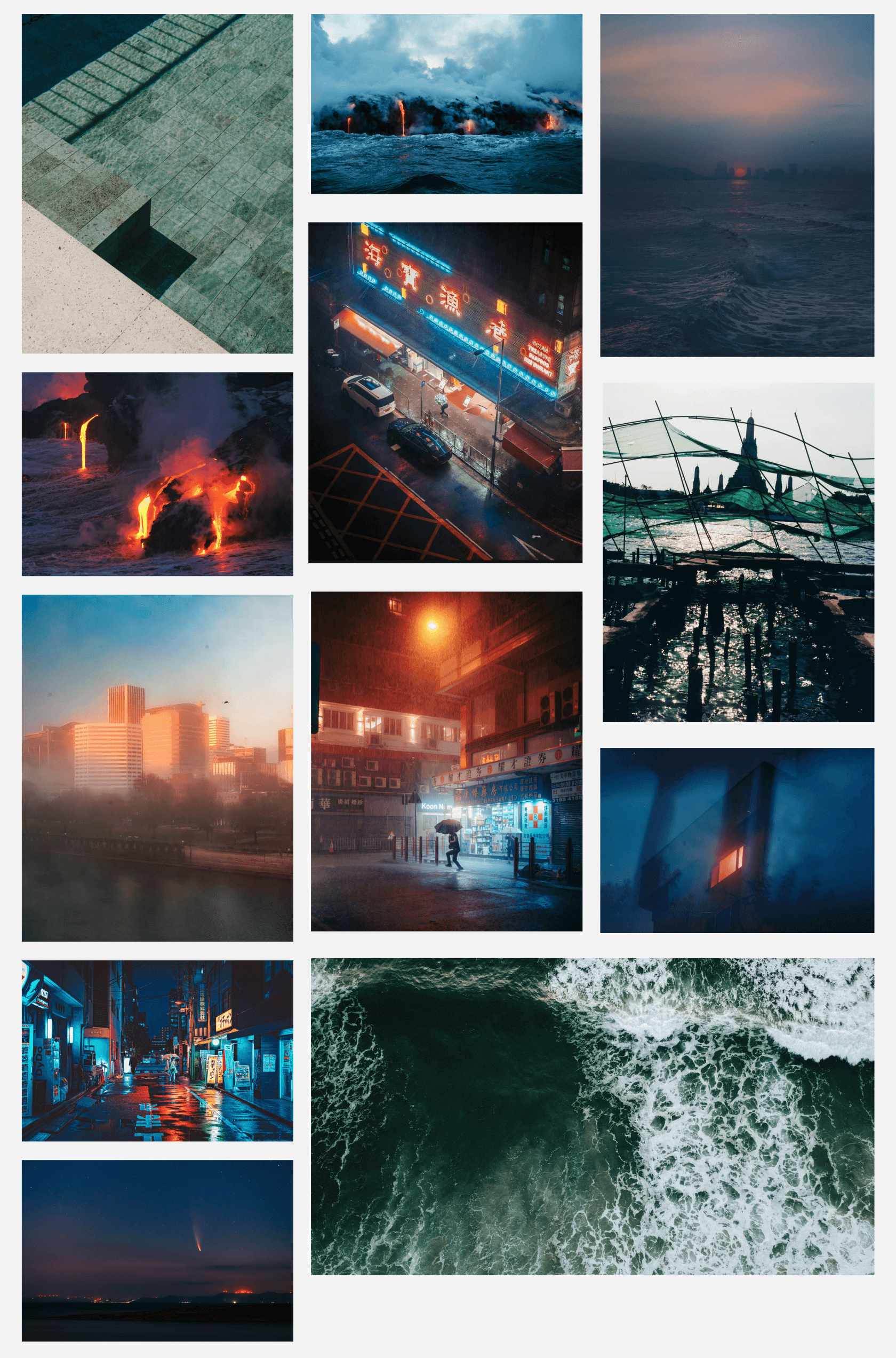
From there I started gathering inspiration in weird places. I wasn't looking at "competitor websites"; I was looking at textures, transitions, inspirational global enterprises, and media from far-flung corners of the internet (thanks Cosmos and Unsplash).
Before long moodboards started taking shape, then comes another challenge, with competing directions only one can really win for a clear and focused brand. Kill a few darlings. Below is the visual moodboard that won out 👇
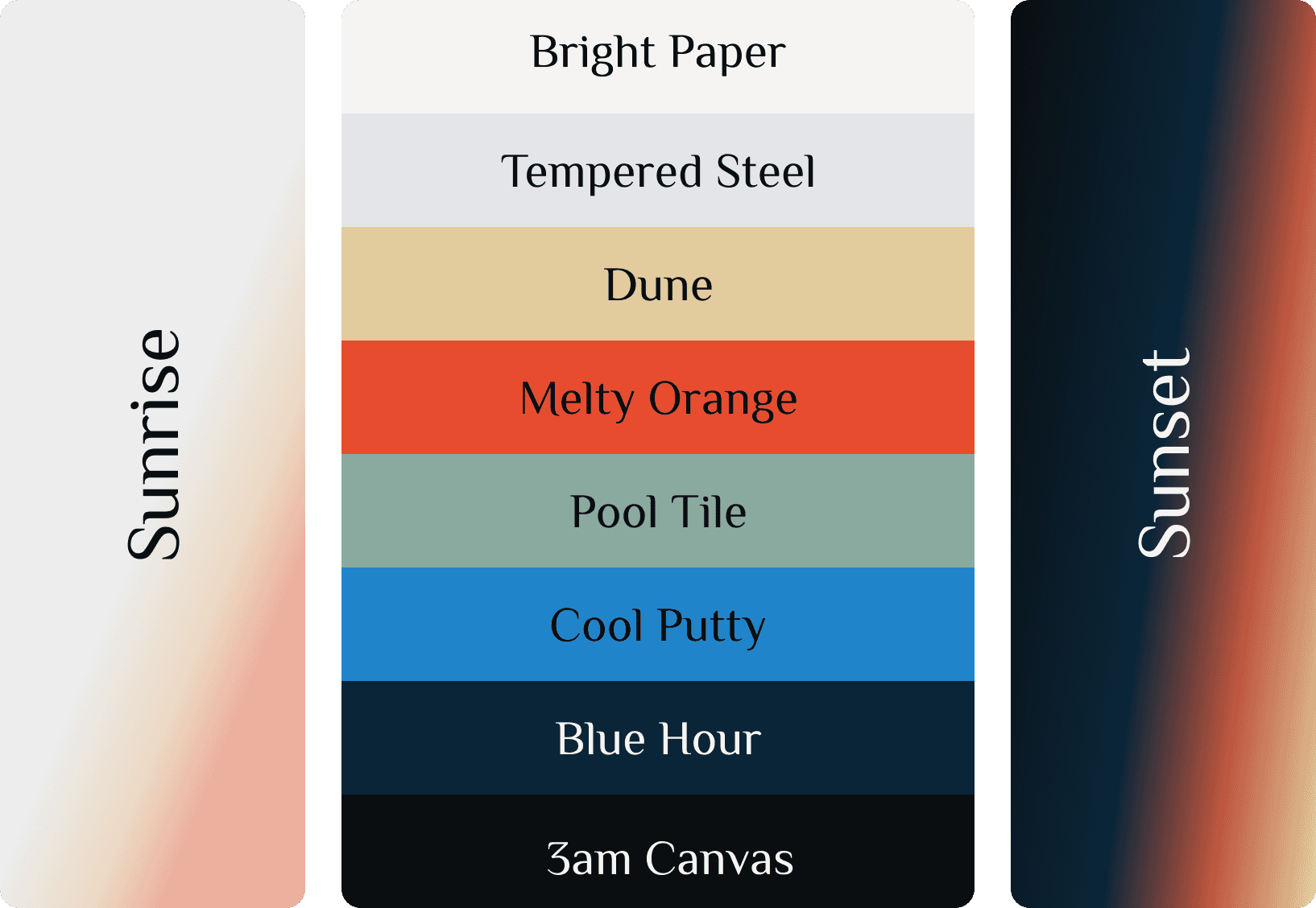
Colour
Another reason I like doing things this way is because a curated set of media makes defining a colour palette much more straightforward. Pulling from the above the colour palette below was born. I also crafted a couple custom gradients (one light and one dark) to mimic the natural falloff of colour and reinforce the Melty philosophy.
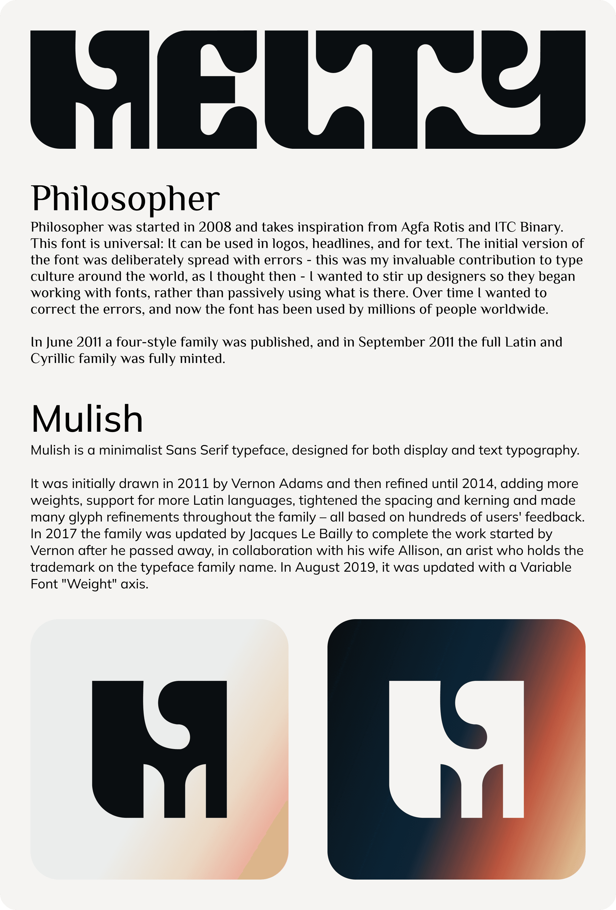
Type + Brandmark + Logo
Typography and logo making is a great example of walking that fine line between form and function. A solid type and logo set needs to carry the energy of the brand while also maintaining readability. It's also an exercise in balance, bringing multiple typefaces together that compliment each other while punching harder than either one would alone.
I toiled for a while trying to find a typeface that carried the full vibe of the brand while also being suitable for use as a paragraph font. Ultimately I decided to build my own font for the brandmark where I could add a bit more flourish and then curate web font's to support that direction; bringing better utility to the table.
—
Build It Once
Once the Brand was locked in, the "Builder" side of my brain took over.
I didn't want anything off-the-shelf so I spent time crafting everything from a blank canvas in Framer. This included custom page templates, several CMS collections, motion effects, custom componentry for the nav and animated buttons, and well… I won't bore you with all the technical details but the process was enjoyable. Every Framer site I build seems to be a smoother, faster, process and I'm loving the tool more than ever.
It’s been a hell of a ride to get the brand to this point. But seeing it all come together?
That was fun :)